Remember that viral dress photo from a few years ago that some people saw as blue and others as gold? The reason lies in how our brains interpret colors differently. The effect was only confusing because it was a photo; the dress itself is clearly blue-black. However, human perception of color isn’t the only factor we deal with at Procedes. Colors can also change depending on the background, lighting, and printing method. Rather than leave this to chance, we make various precise color management adjustments to ensure a perfect print result. Here’s how we do it, as explained by Procedes expert Jens Sauter.


Individual color management for every material
We work with 30 to 35 different materials for our customers, and about one in five projects requires special colors. We use the Pantone Matching System, which assigns numbers to each color, but we don’t solely rely on it. Colors can appear different based on background, lighting, and even the viewer’s perception due to their spectral composition.
Precise color management ensures that printed products are made to the highest standard. Achieving this requires not just cutting-edge machines and advanced printing techniques but also experts who can scrutinize print data and eliminate potential issues. We start by providing customers with a general data sheet outlining specifications for creating print files. The more accurately these specifications are followed, the smoother the process will be. Even so, our experts meticulously check each file before printing to ensure the result matches the customer’s vision on the desired material and under the intended lighting conditions.
How color management works and why it’s necessary
Successful color management ensures that colors appear as true as possible across all output media. This means a color should look the same regardless of the device or medium used, whether it’s a digital screen or a physical print. In printing, our standardized technical setup in Lemwerder guarantees consistent results. However, our customers’ environments often differ. For example, we can’t know how a trade show banner will look on a client’s computer screen. Moreover, screens display colors in RGB (red, green, blue), whereas printing requires CMYK (cyan, magenta, yellow, black). In short, we need a consistent standard that bridges digital and physical color representation.
The ICC Profile: Standard for color management
The ICC (International Color Consortium) profile standardizes color tones and includes data to characterize all color spaces used. This profile shows how RGB colors from a screen will translate onto printed materials. We provide our customers with a downloadable standardized color profile to ensure we’re on the same page. This profile is the foundation for converting digital designs to our printing machine.
Understanding color space
Our data sheet states: “We accept print data in the CMYK color space, as our digital printing systems operate in 4 or 6-color mode (CMYK + light cyan and light magenta).” But what does this mean? A color space refers to the range of colors a printer can produce. If a color cannot be printed, it falls outside the color space.
The CMYK color space is standard for professional printing, with black (key) being necessary since it cannot be created by mixing the other three colors. We enhance our color space by including light cyan and light magenta for smoother gradients and skin tones.
These six colors form the color space of our Procedes printing machines.
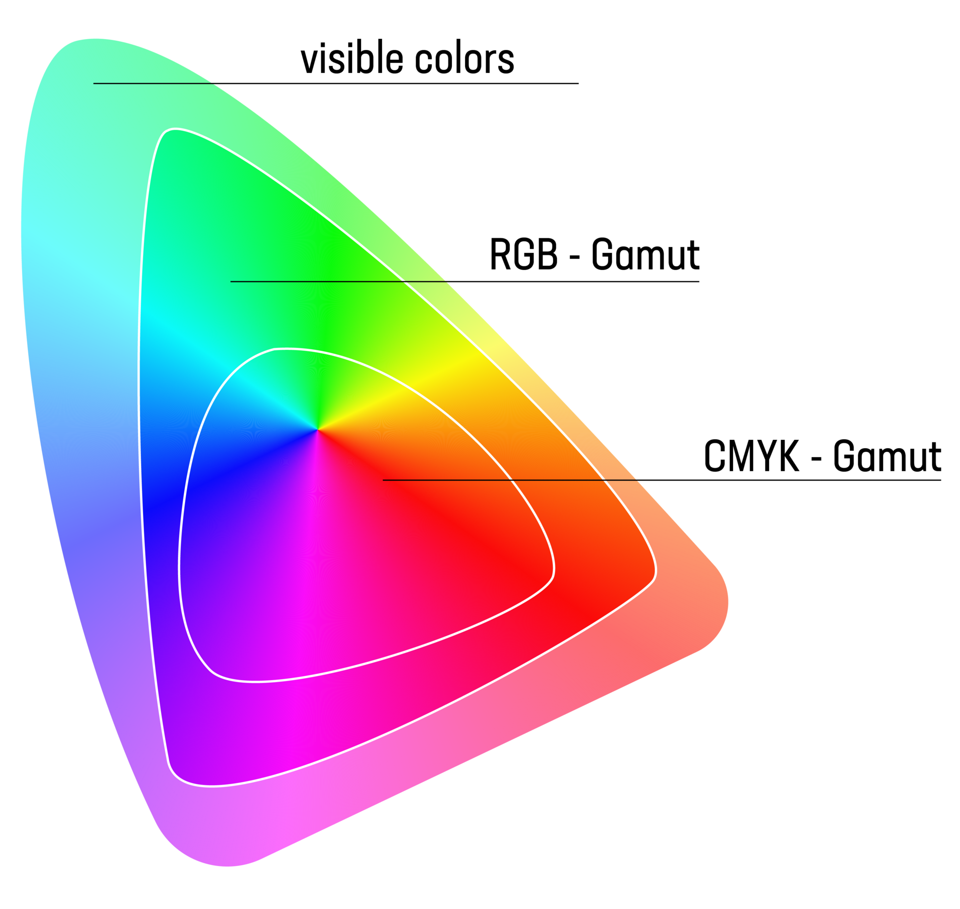
A color gamut defines the range of colors a device can reproduce, whether it’s a monitor, printer, or camera. It is often represented in a three-dimensional space, with dimensions for primary colors (RGB) or characteristics like brightness, saturation, and hue.
A larger gamut means more colors can be displayed or detected, while a smaller gamut covers fewer colors.
Simplified:
- RGB Gamut: The range of colors that a monitor can display using red, green, and blue. Each device has a limited capacity for color reproduction.
- CMYK Gamut: The range of colors printable with cyan, magenta, yellow, and black inks. In digital textile printing, we are bound to the CMYK gamut, which is narrower than RGB.
Understanding gamut is crucial for managing color reproduction across different devices and media.
Our color perfectionism: A physical space for testing
When we receive customer files, we automatically check for errors, dimensions, resolution, and other specs. Once we confirm that our machines have the correct color information, our unique Procedes color management begins. This isn’t just metaphorical—we have an actual room dedicated to color testing. It’s stocked with materials printed with Pantone color swatches, and the lighting is standardized to ensure accurate color evaluation. Our Lemwerder facility is far from a small print shop; we print on a massive scale.
Yet, printing remains a craft for us, and each project undergoes multiple quality checks.
Our experts physically compare customer color samples (like carpet swatches, flyers, or paint chips) with Pantone colors on our materials to ensure an ideal match. If needed, we backlight the printed product to see how lighting affects the color.

What Is standard Light?
Standard light refers to specific lighting conditions for viewing images or objects consistently. The printing industry in Germany has an ISO standard (3664) for this, using a light source with a color temperature of 5,000 Kelvin, known as Standard Illuminant D50.
If you’re curious for more details, feel free to reach out — we’re happy to explain!
Test prints for added assurance
Sometimes, color specifications aren’t enough. If a customer requests an unfamiliar material or if we need to be certain, we run a test print. This is especially useful for special colors. We share these prints with the client for approval and keep a copy for reference.
Handling RAL Colors
Matching colors from powder-coated surfaces, like those defined by the RAL color system, is challenging. Our printers don’t directly support RAL colors, so we use Pantone charts and samples to get as close as possible. A test print ensures the color is accurate, and our experienced team carefully monitors every step of production. The result is a product that meets Procedes’ high standards and exceeds customer expectations.
![[Translate to English:] Round textile sculptures in white hang from the ceiling.](/fileadmin/_processed_/f/7/csm_cta-procedes_b2c2ad64de.jpg)